


In 2004, our Board embarked on a journey to develop our “brand” … just like many companies and charities do! Something that stood apart from the rest, attracted attention and was inviting to people.
With a name like Global Flying Hospitals, which meant aviation, combined with medical care and hospitals, we realized that our brand had to signify “flight” … and even more so, something that meant health and healing. After a journey of almost one year, a Singaporean design company assisted us and put forward the butterfly – one that incorporated flight …. and also metamorphosis … as a butterfly transforms from a caterpillar into a beautiful butterfly a by undertaking a metamorphosis – it is transformed into an insect of beauty.
Now, how to add a butterfly and make it stand apart? Asian design principles! Asia loves color as reds, pinks, gold, purple. From their rich pallet, the design team were able to bring all these colors together, even combine it with the correct font style – and create a brand that turns heads. Hence, the GFH butterfly brand!
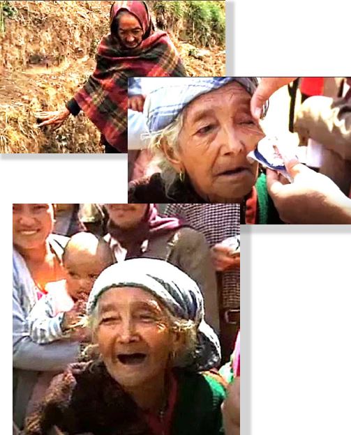
So, when the rubber touches the runway – with our mobile clinics, expandable hospitals, emergency shelters, water and sanitation systems … we believe that people’s lives are also TRANSFORMED … and smiles ensue.
 ACNC Registered Charity Logo RGB
 logo 2
-210bf3-original-1677594902.png) 470347 01 Wise logo bright green (1) 210bf3 original 1677594902
 macau